sperry seasonal Color, Material, & Trends
Collaborated with the product team to develop seasonal stories and direction. Oversaw the men’s and women’s design teams in defining seasonal trends, color palettes, material packs, prints, and overall themes.
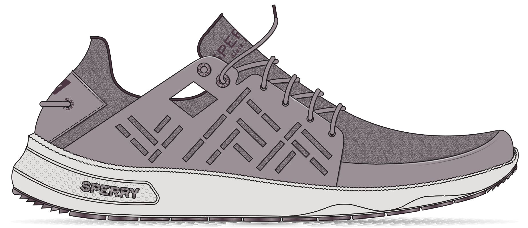
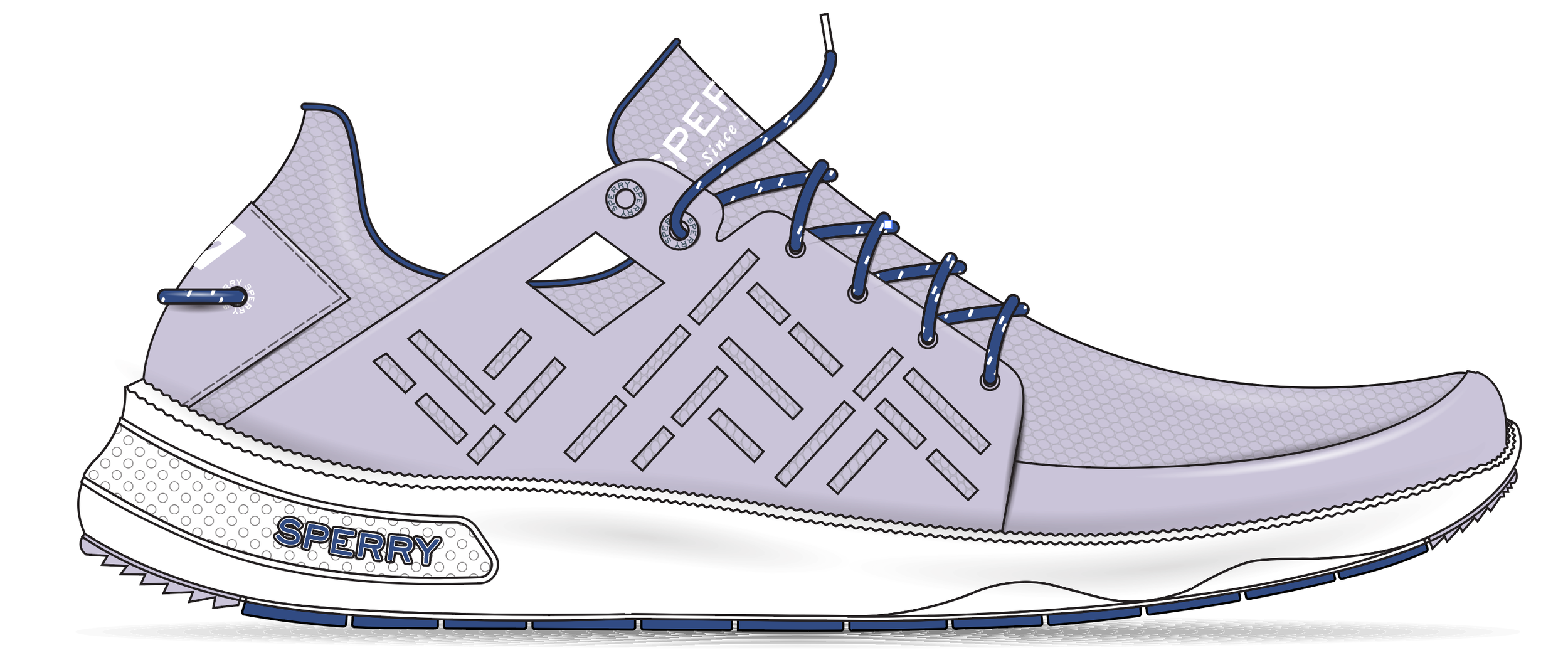
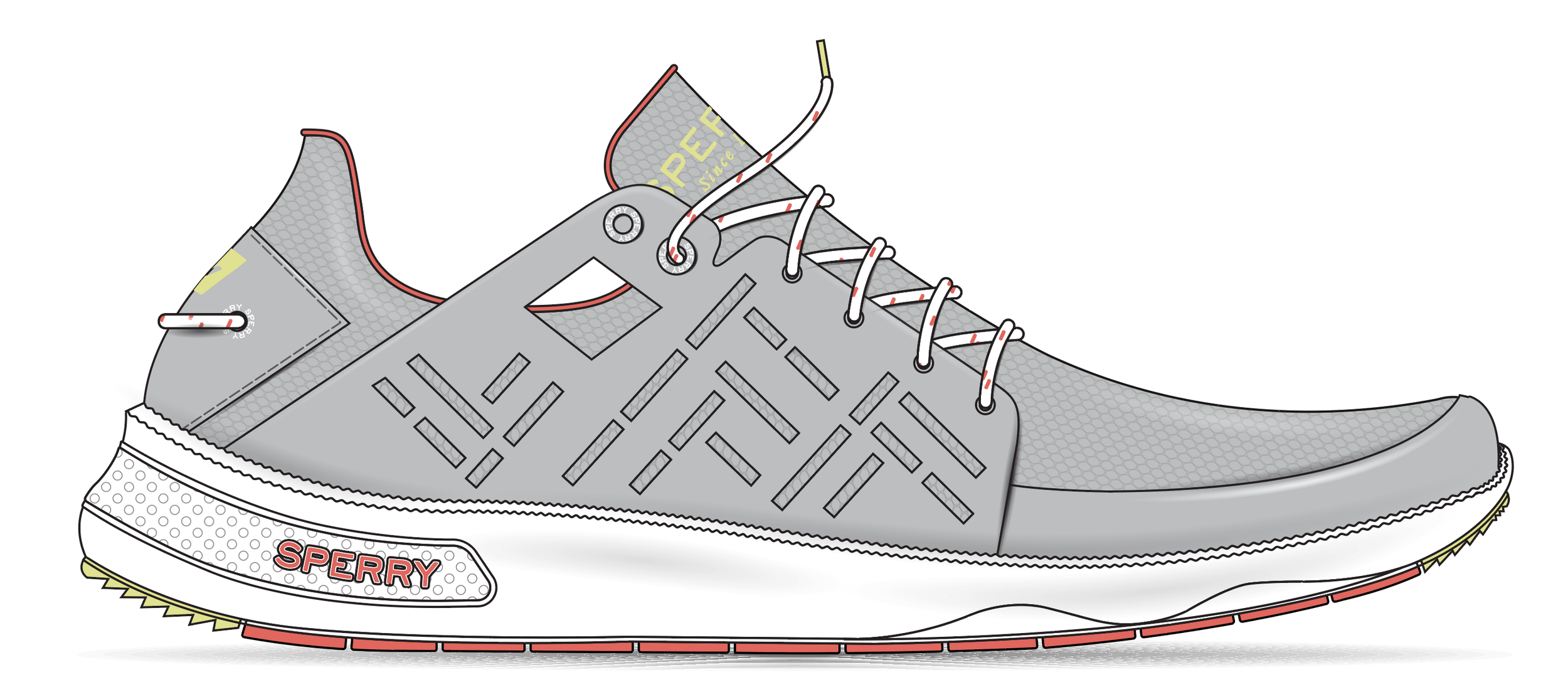
BETWEEN TIDES: 7 seas sport, spring
Between Tides captures the quiet confidence of spring sailing, when conditions are cool, light is soft, and movement is deliberate. Muted sea-glass greens, stone greys, and warm coastal neutrals reflect misty mornings, weathered decks, and calm waters, while subtle accents add depth without noise. The palette is refined and balanced, designed for transitional conditions where control, feel, and trust matter more than speed.
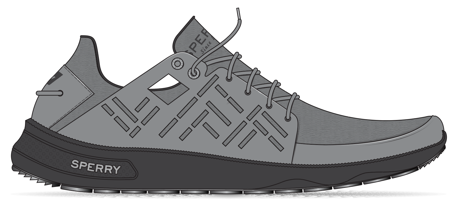
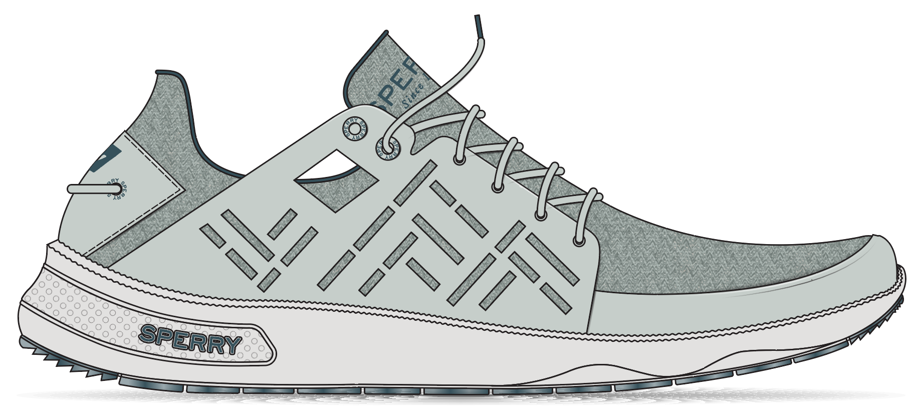
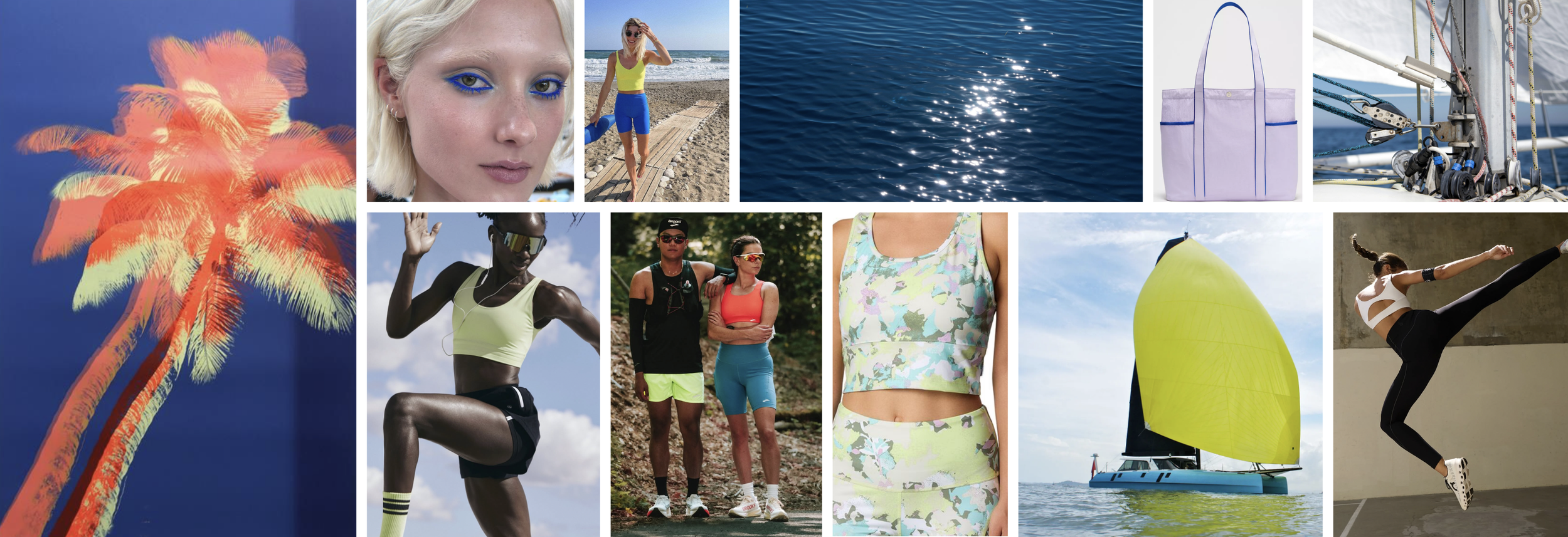
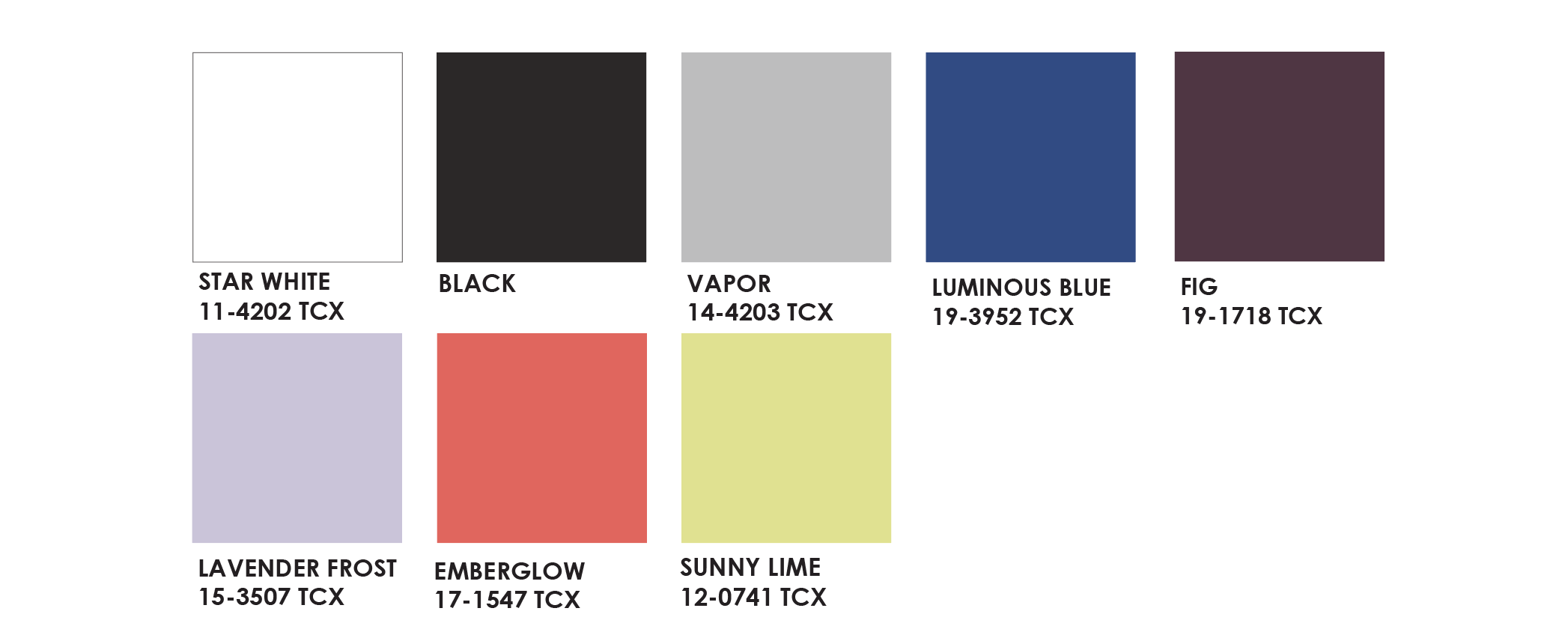
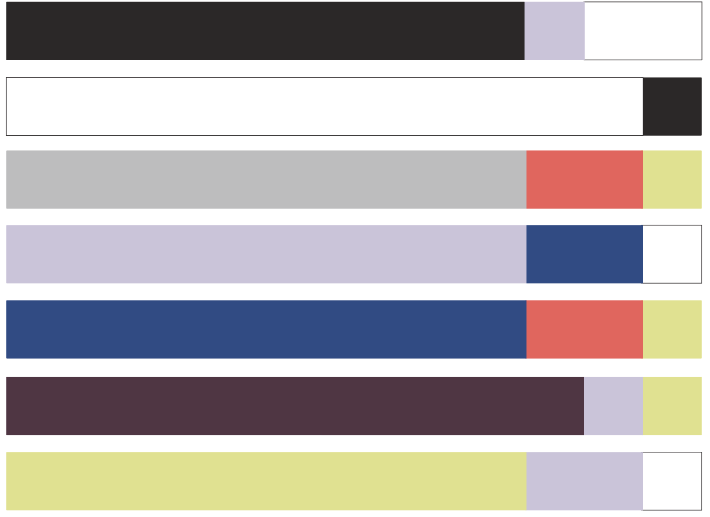
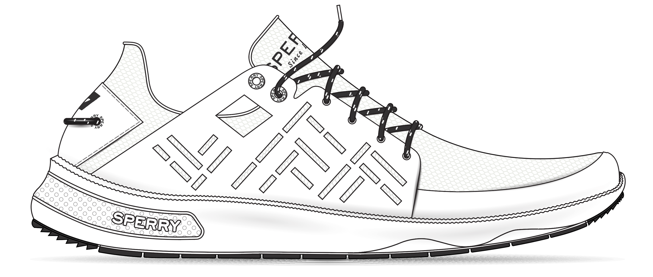
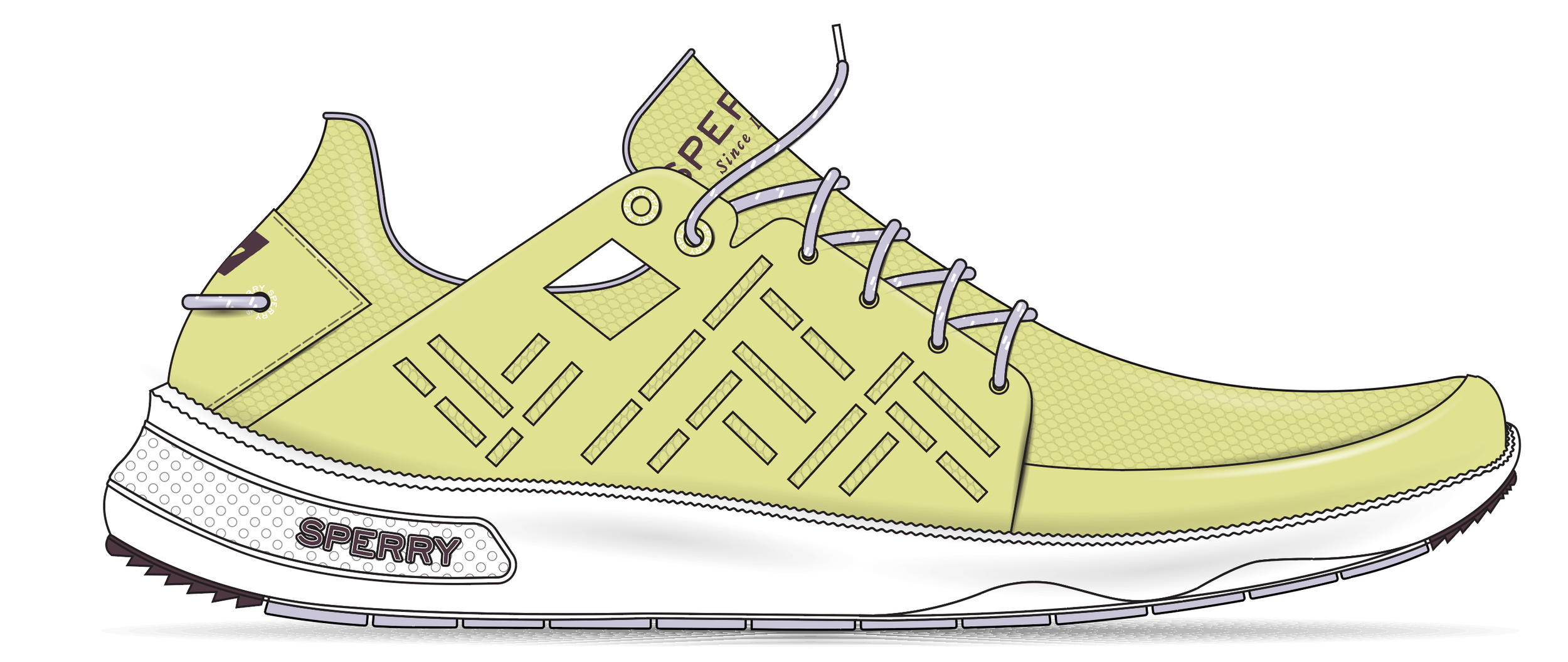
open water: 7 seas sport, summer
Open Water captures the clarity and intensity of summer sailing, when the sun is high, visibility is critical, and movement is constant. Luminous blues and crisp whites reflect open horizons and sunlit seas, while high-visibility lime and ember coral cut through glare with purpose. Grounded by black and cool grey, the palette is bold yet controlled, designed for peak conditions where speed, precision, and confidence are fully on display.
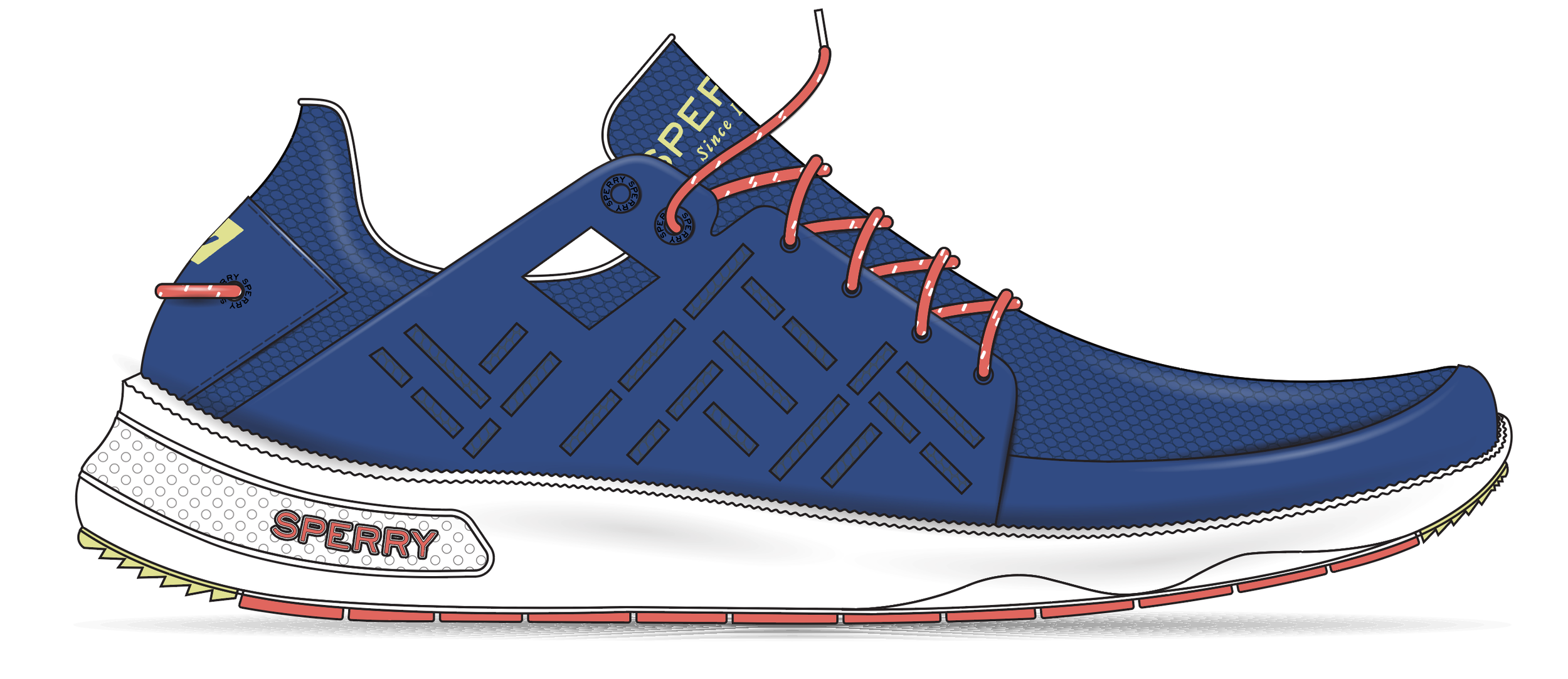
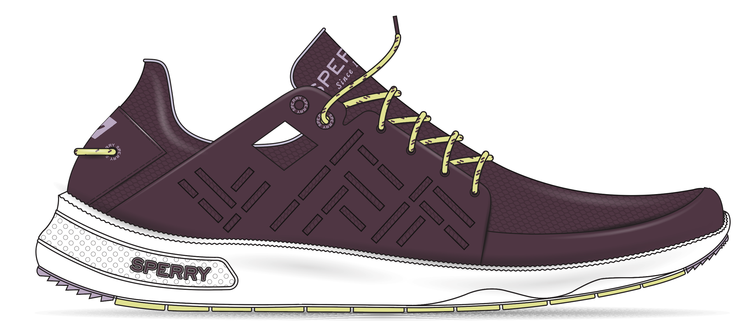
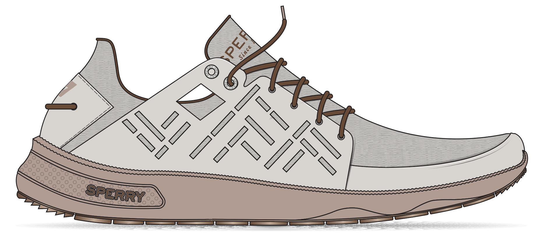
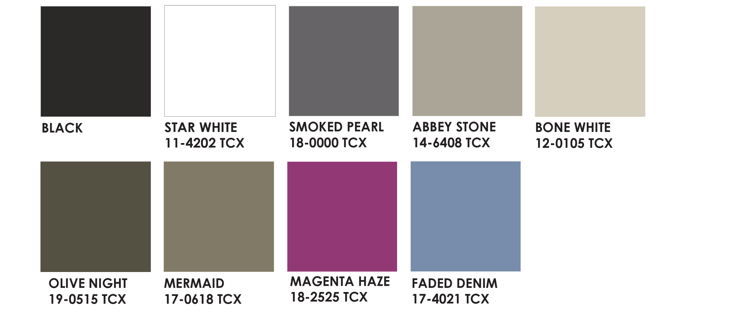
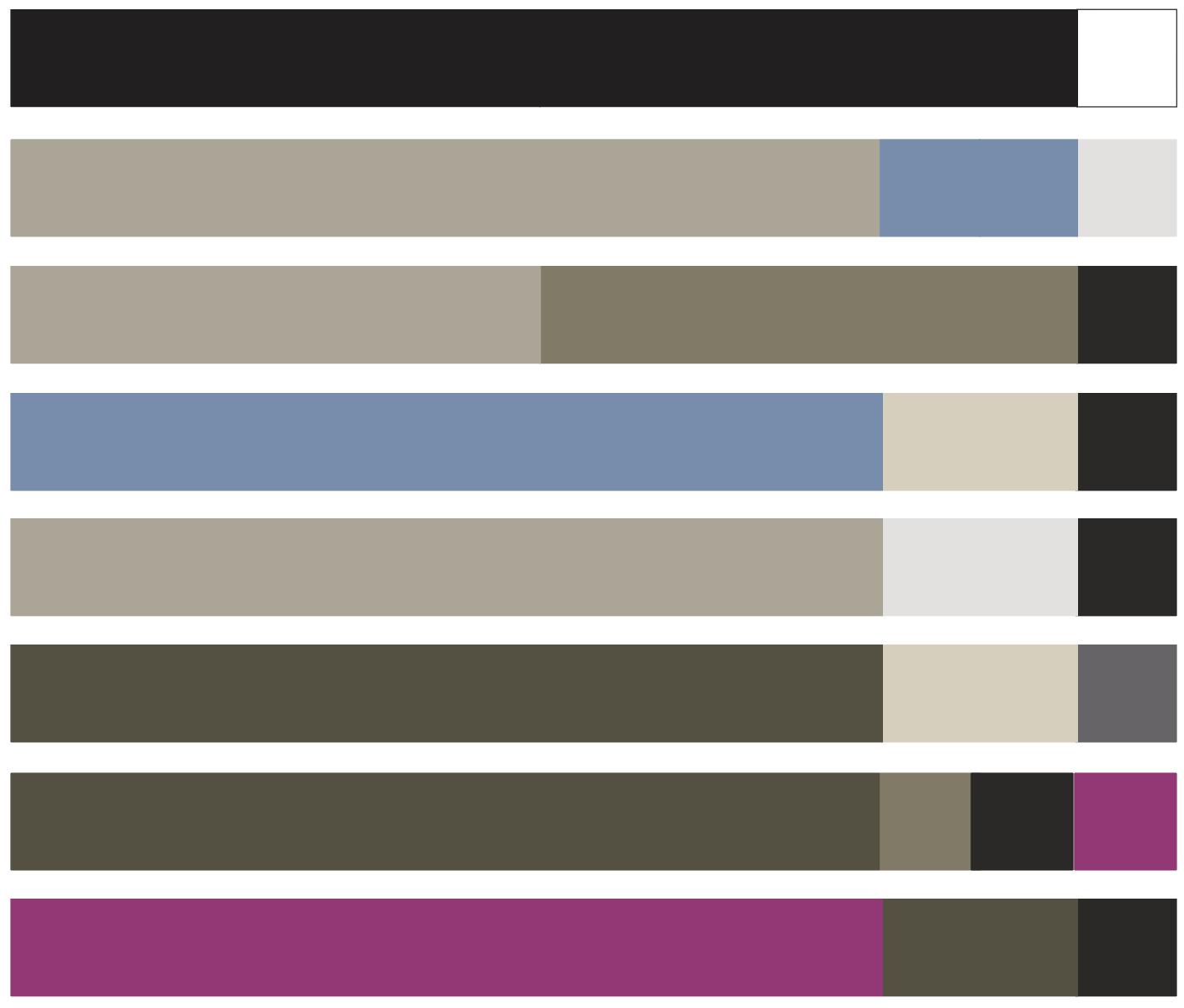
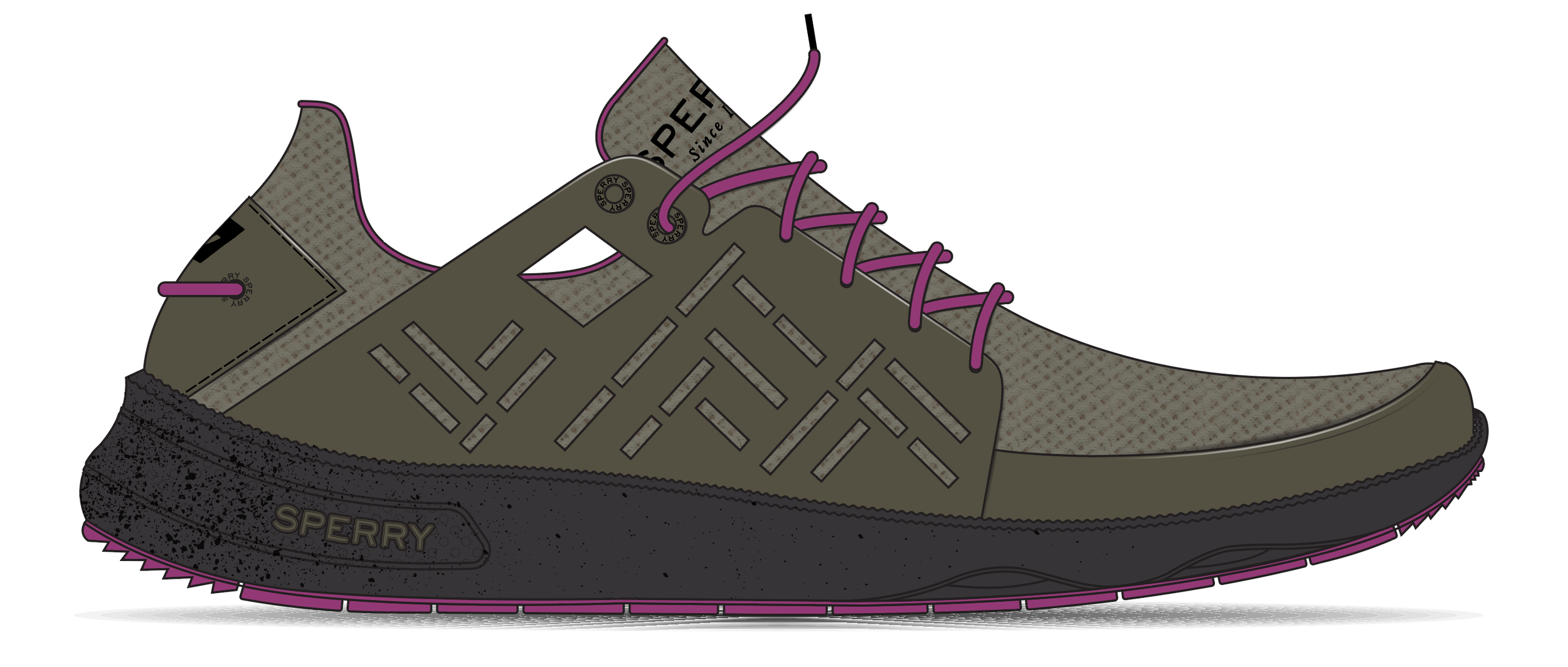
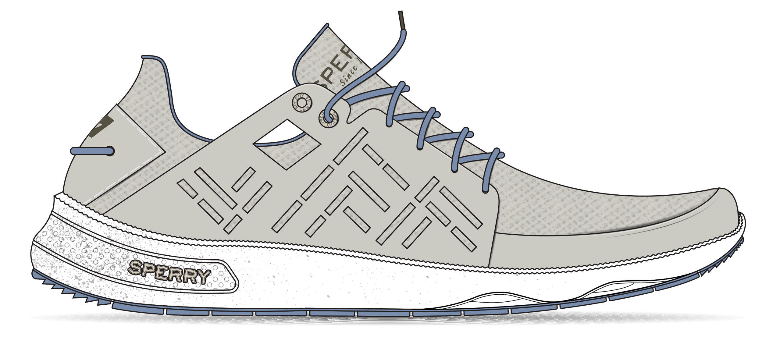
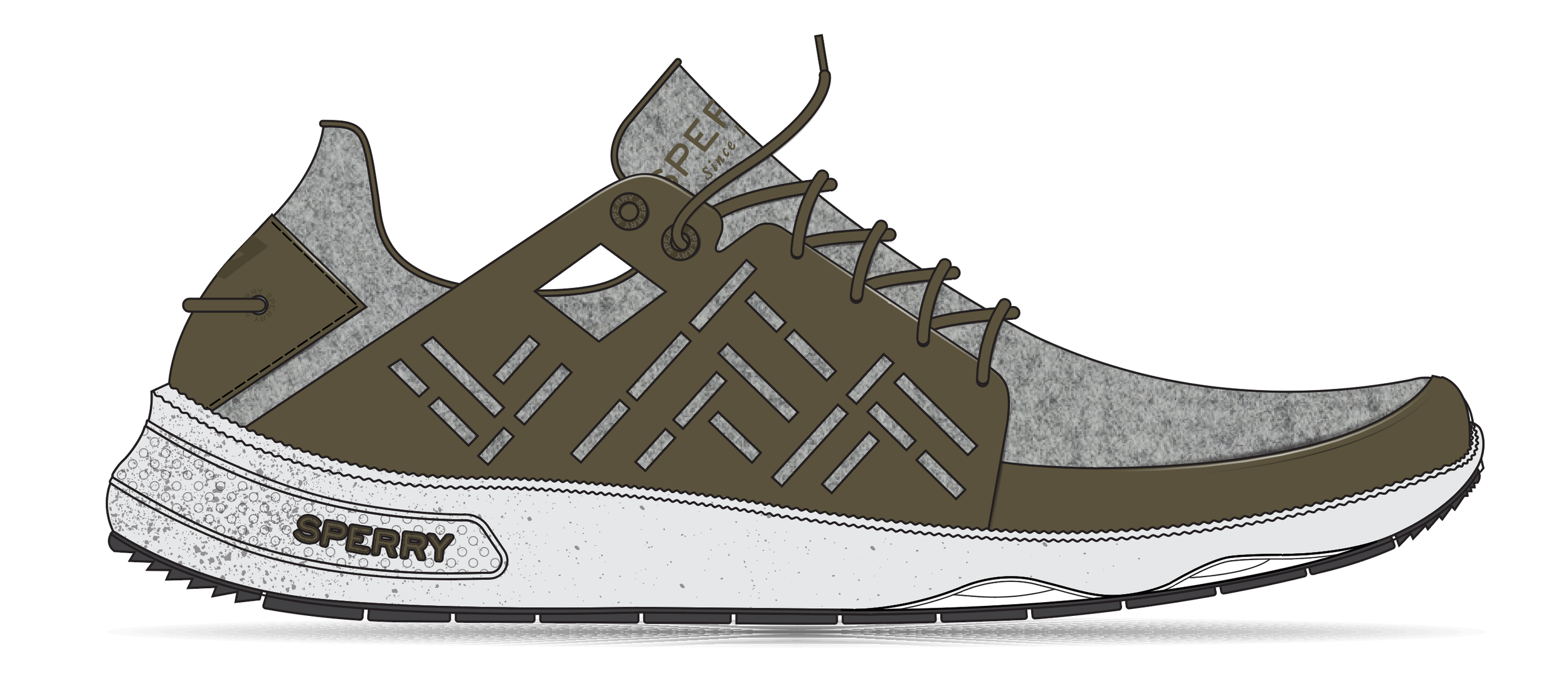
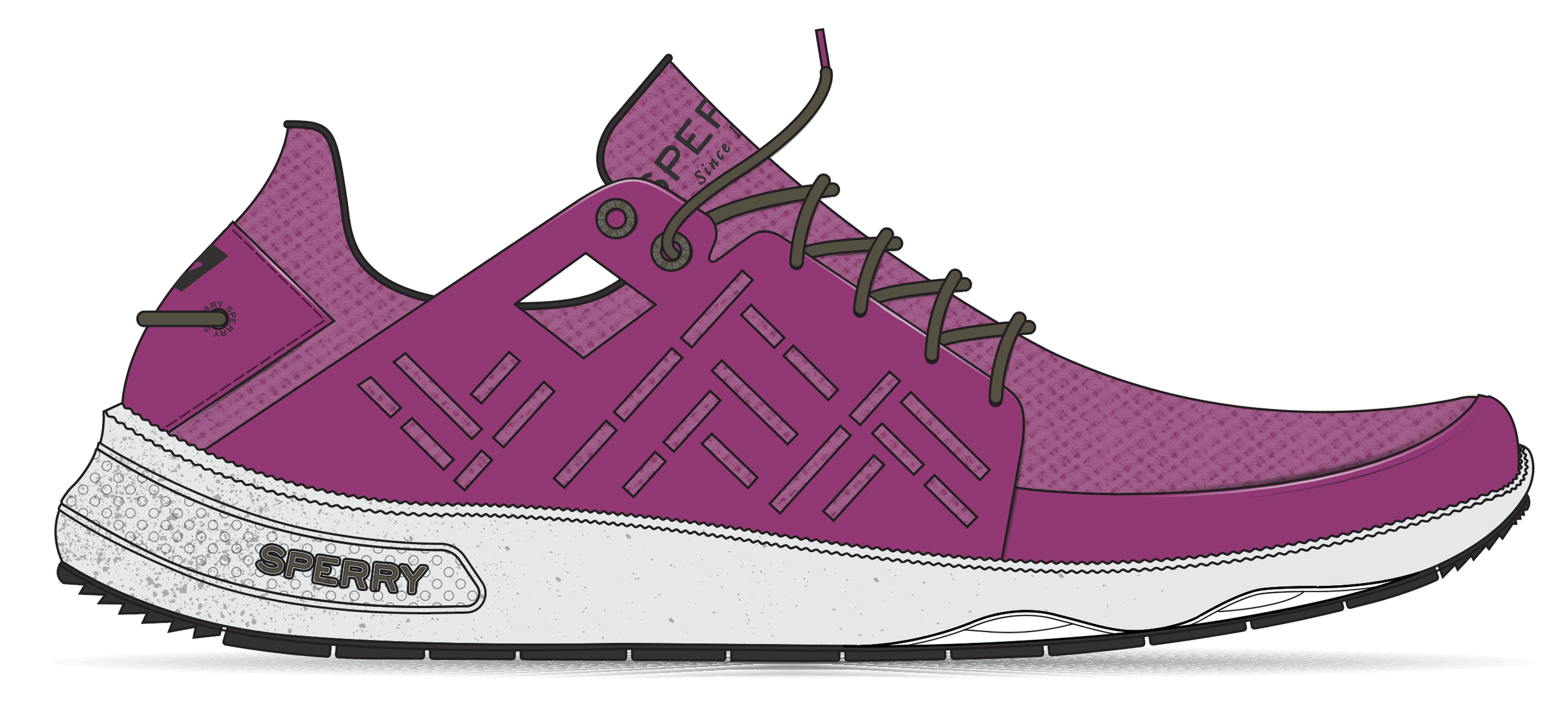
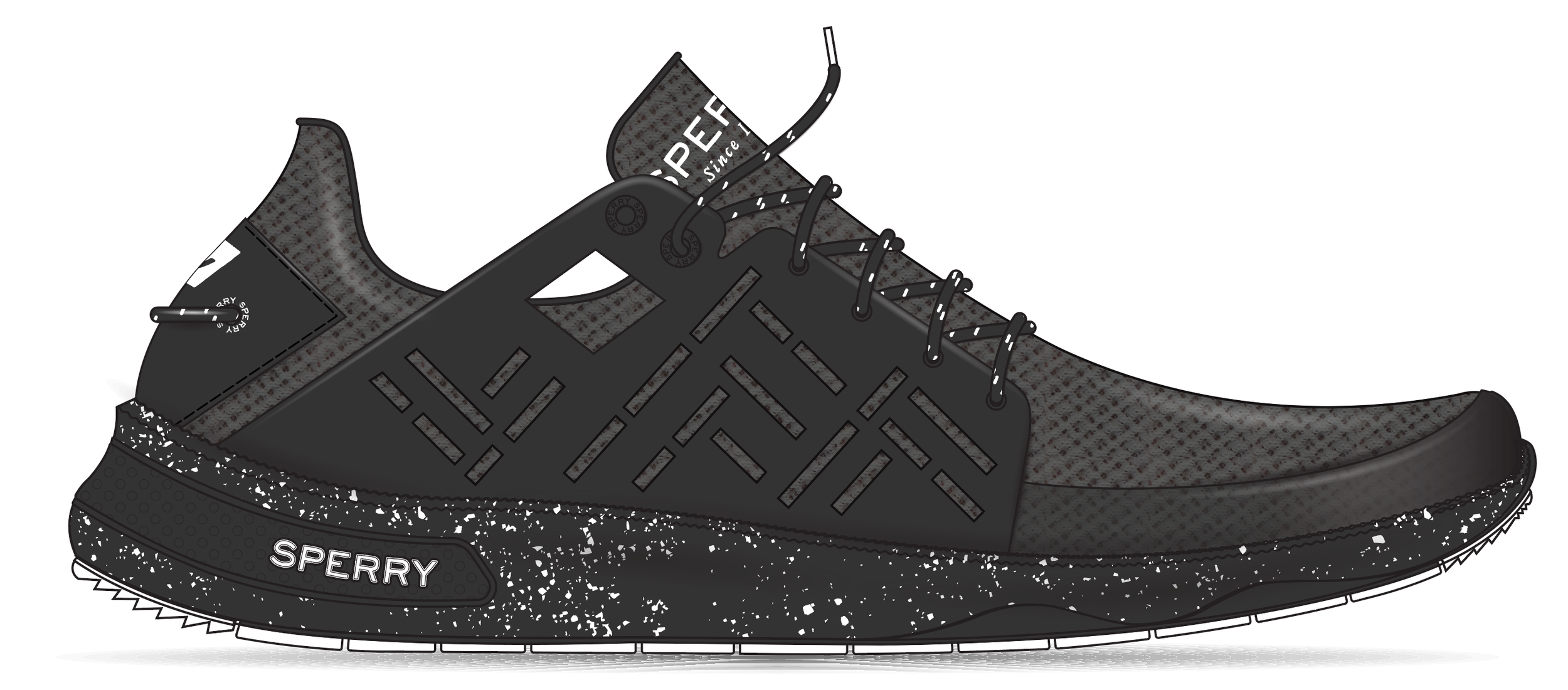
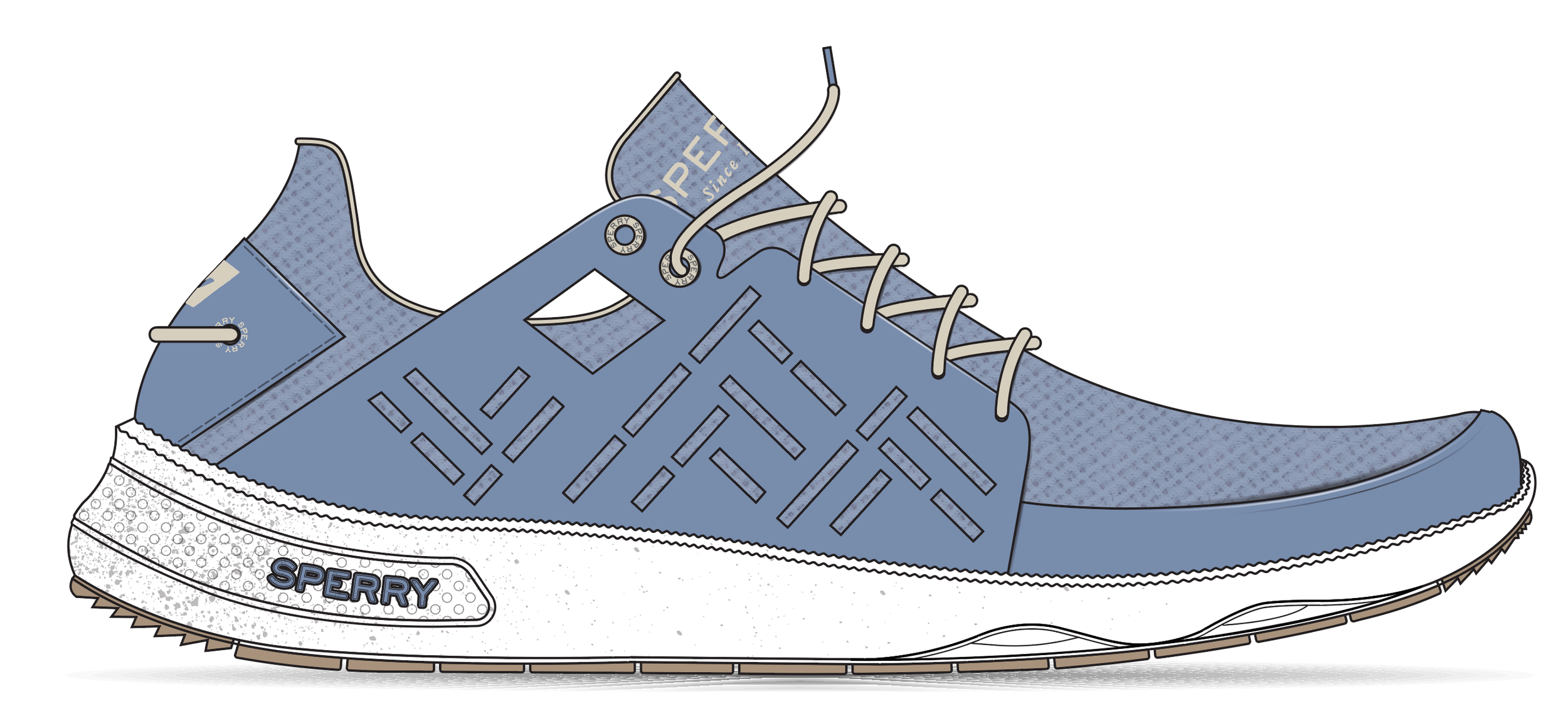
DEEP WATER: 7 seas sport, winter
Deep Water captures the resilience of winter sailing, when temperatures drop, light fades, and conditions demand confidence and protection. Darkened neutrals, stone greys, and grounded olives reflect cold seas and overcast horizons, while icy blues bring crisp clarity and optimistic pops of magenta add warmth. The palette is weighted and enduring, designed for stability, comfort, and performance when every detail must hold.
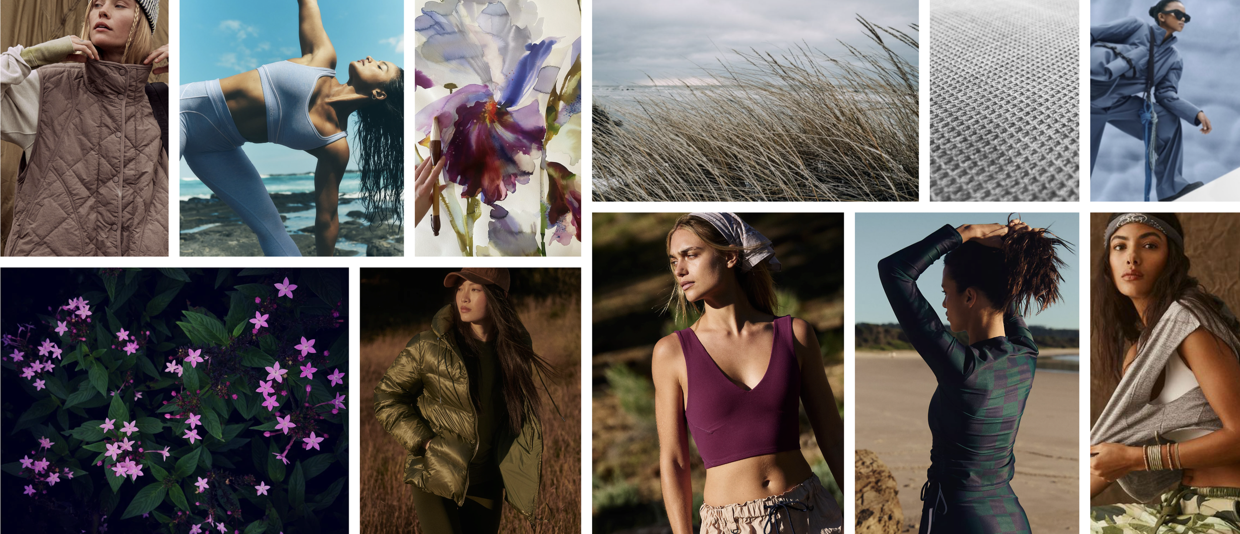
Stealth Wealth
This trend story was inspired by the quiet luxury movement. It showcased effortlessly chic looks that exuded confidence. A relaxing color palette and luxurious materials displayed quality in timeless pieces. Handcrafted details such as hand stitching and weaving were used to set classic styles apart.
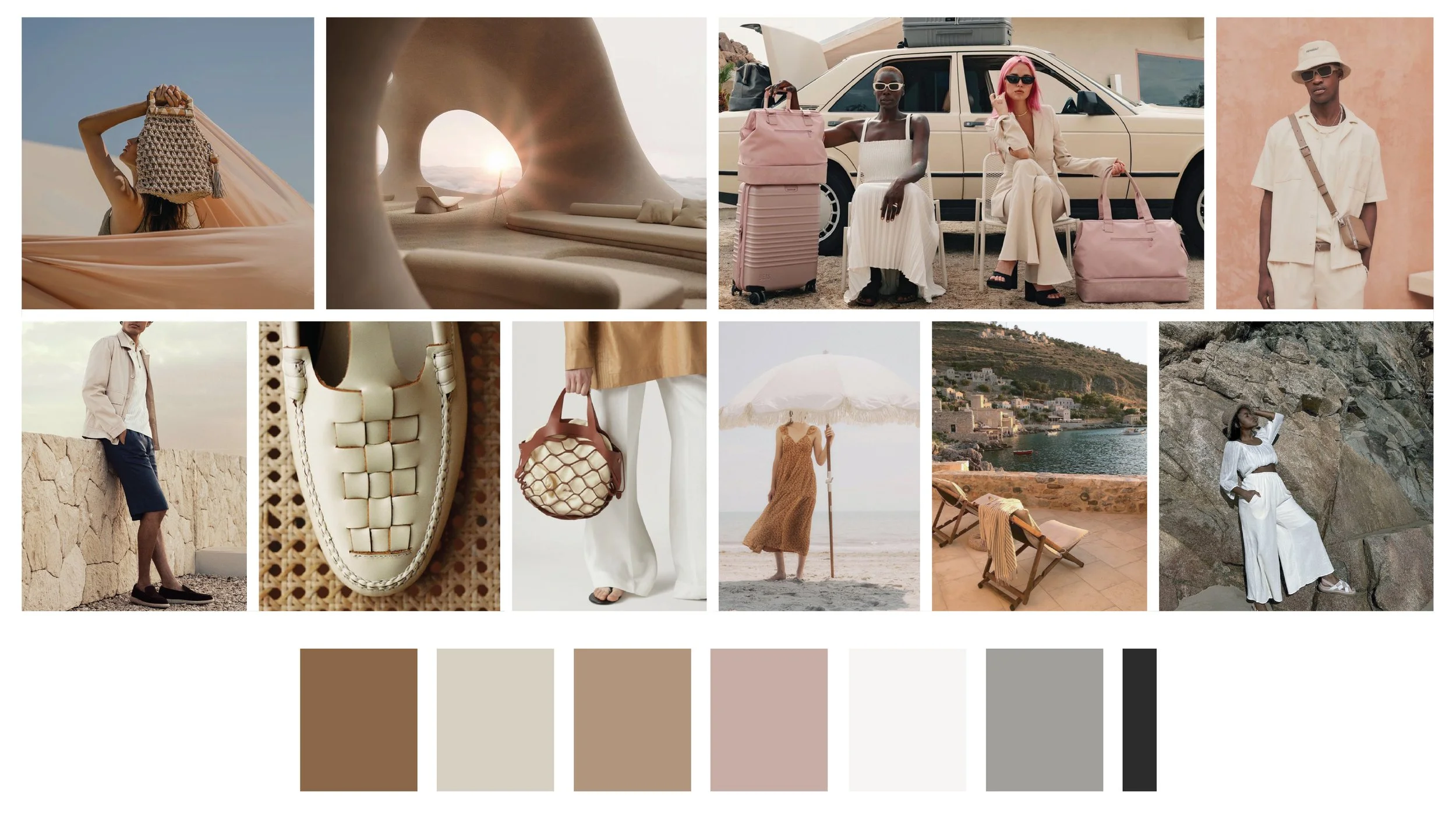
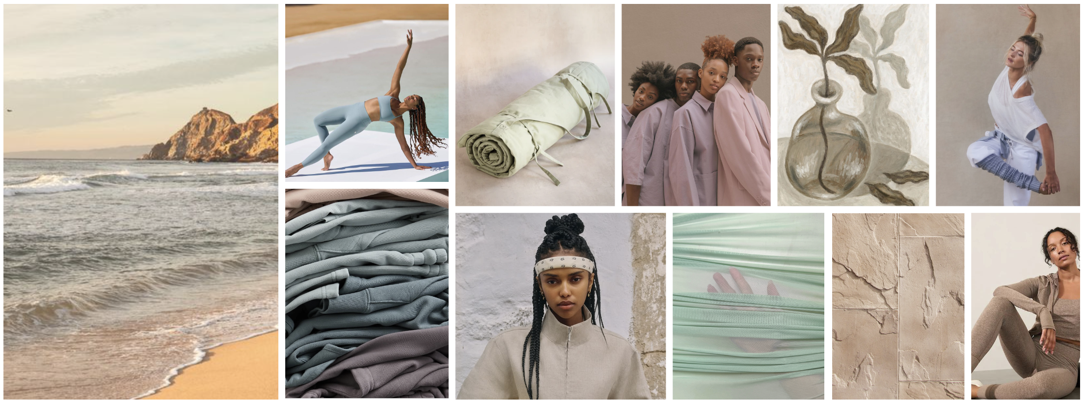
INSPIRATION FOR THE VIBE AND COLOR PALETTE
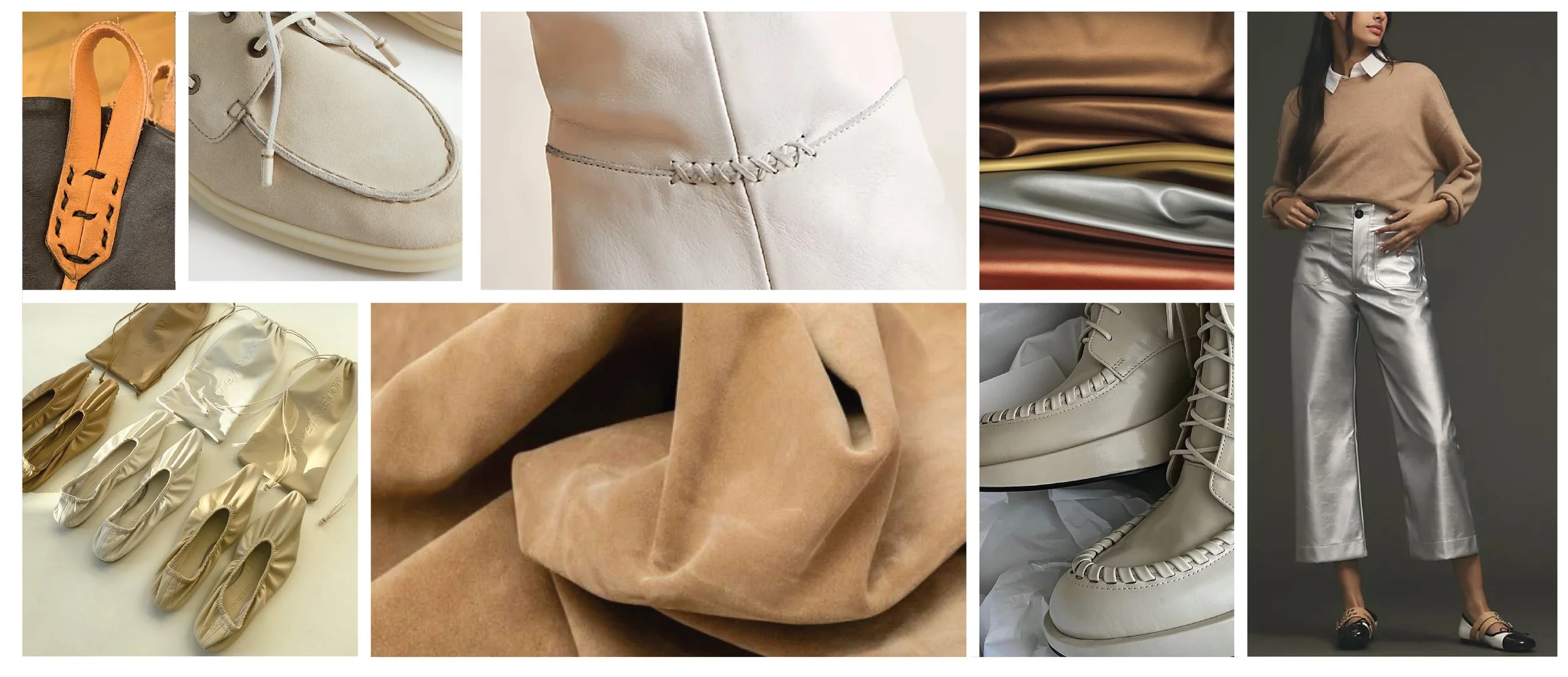
MATERIAL AND DETAIL INSPIRATION
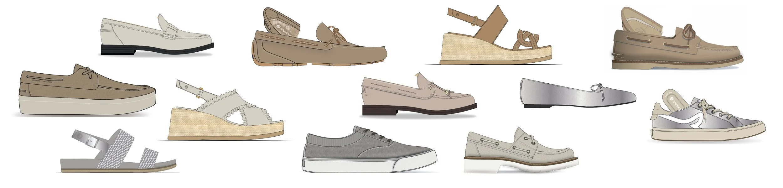
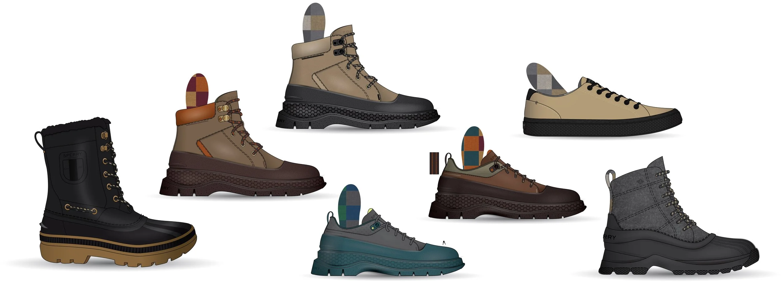
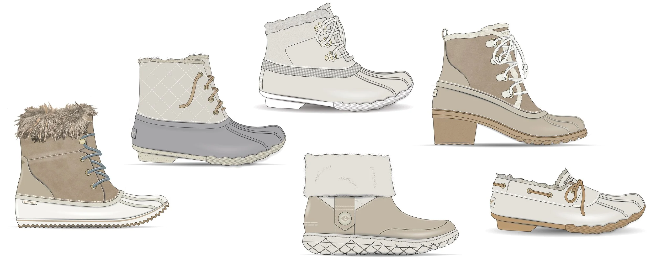
COLLECTION CADS
Camp Life
This men’s trend story celebrated individual style. Here, vintage were mixed with modern looks that brought vacation vibes to you. The color palette consisted of slightly washed-down primaries and classic neutrals. Water-resistant leather was mixed with nubby canvas and ripstop to bring durable outdoor functionality.
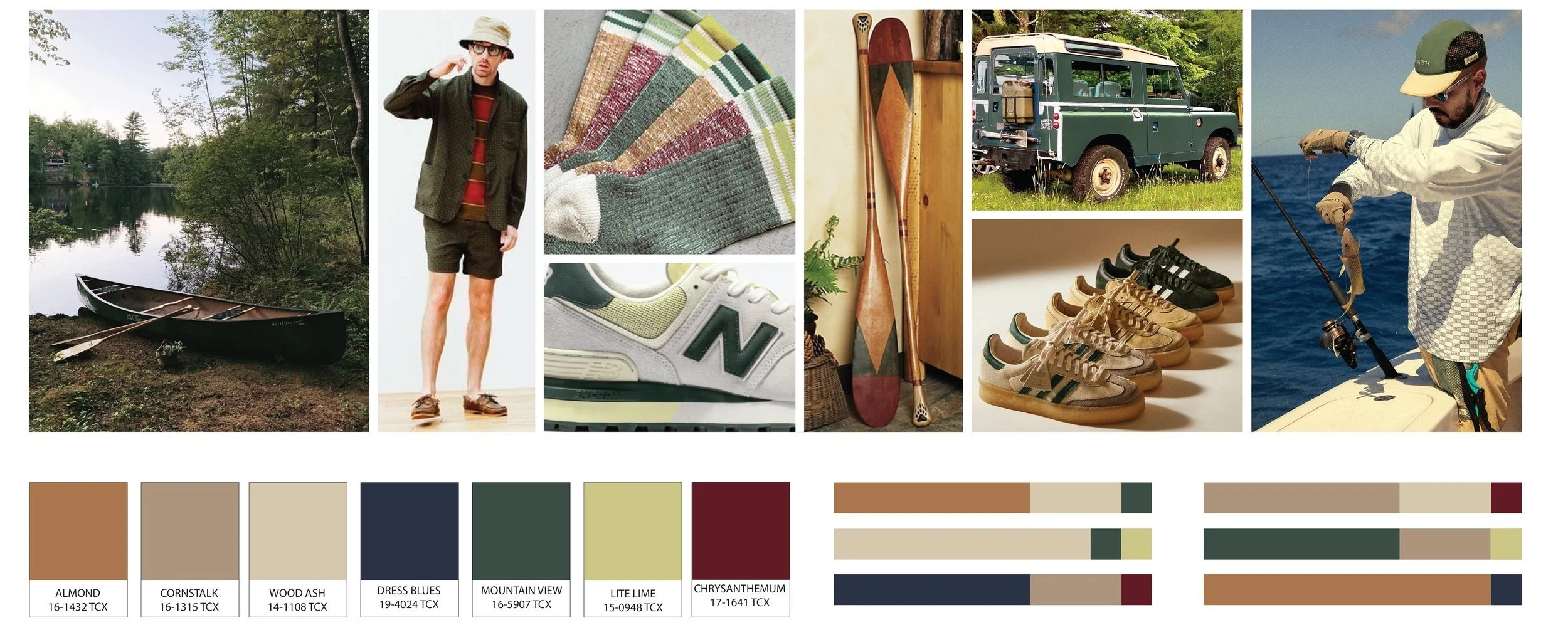
INSPIRATION FOR THE VIBE AND COLOR PALETTE
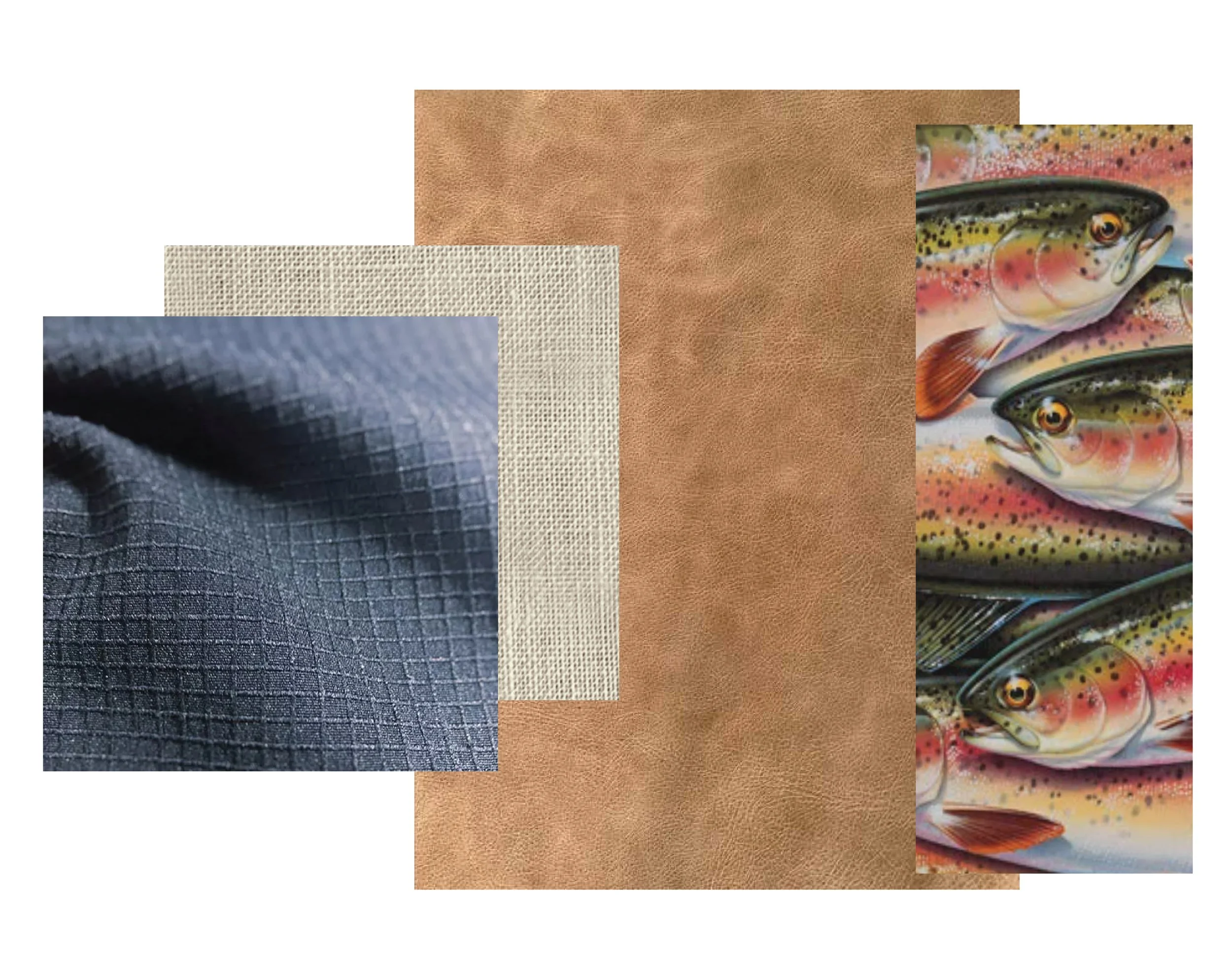
MATERIAL AND PRINT PACKAGE
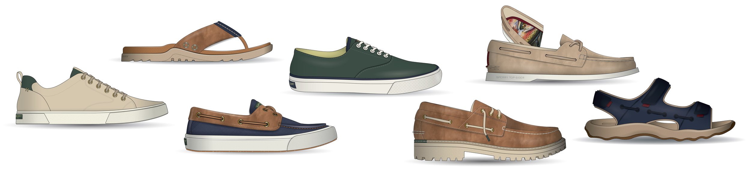
COLLECTION CADS
COZY FROST
This women’s trend story focused on texture and warmth. Cozy shearling and soft nubucks invited you to slip into the shoes while still looking chic. Grab a latte and enjoy.
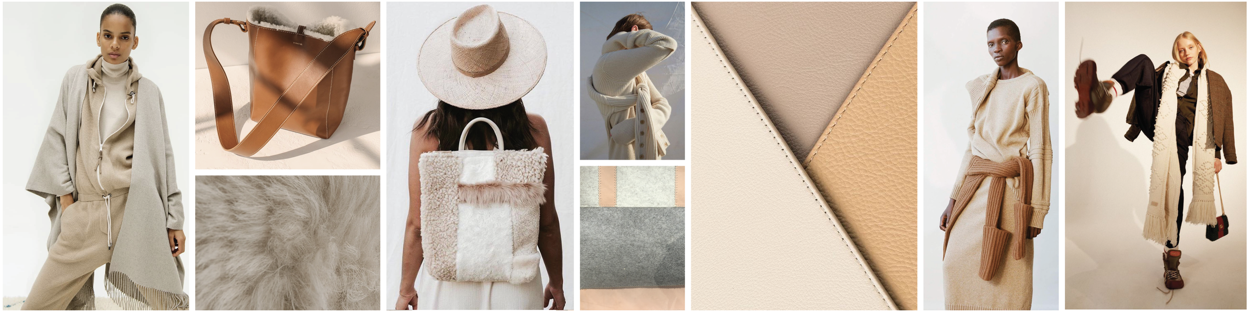
INSPIRATION FOR THE VIBE
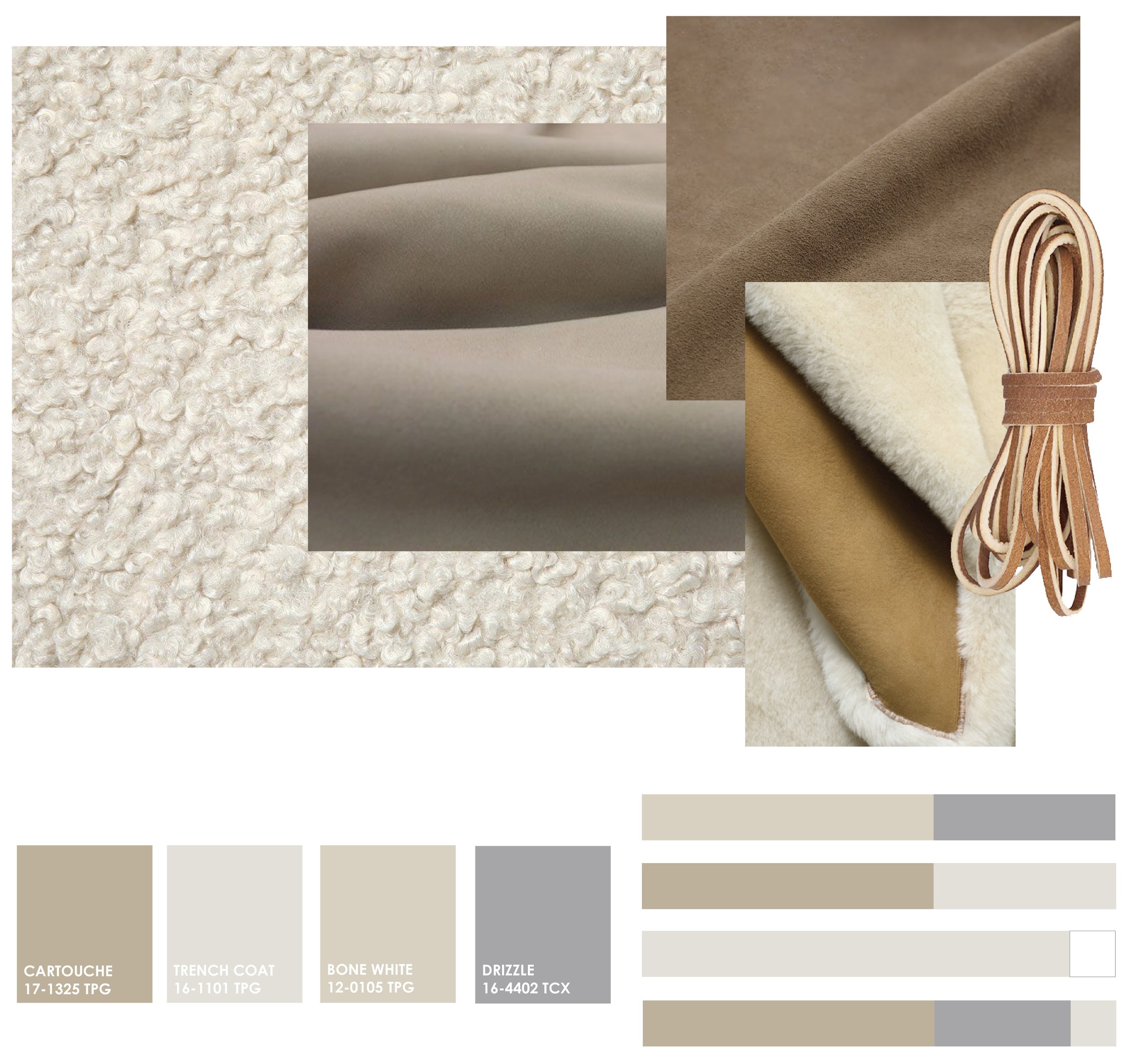
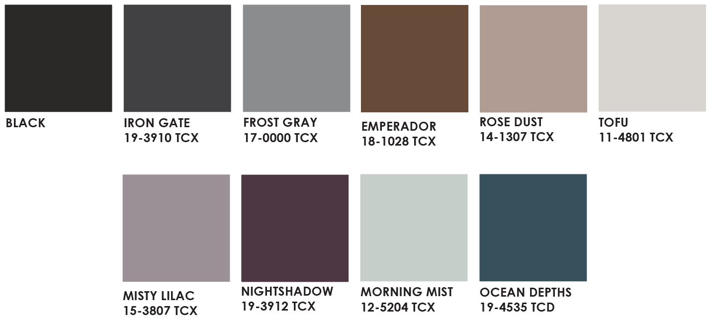
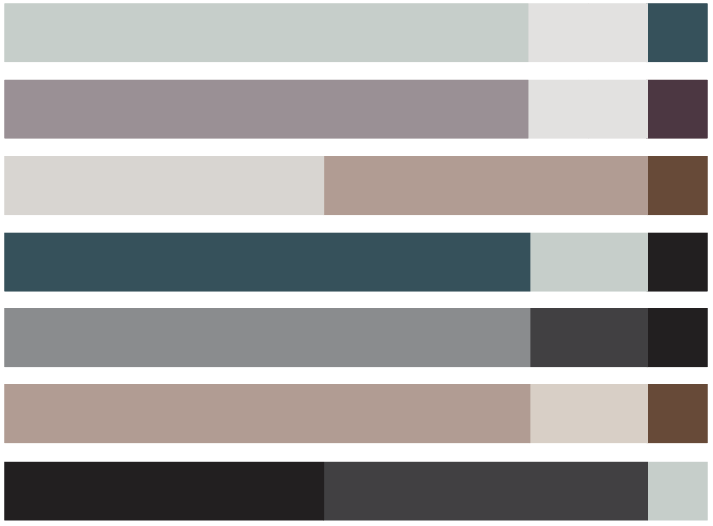
MATERIAL AND COLOR PALETTES
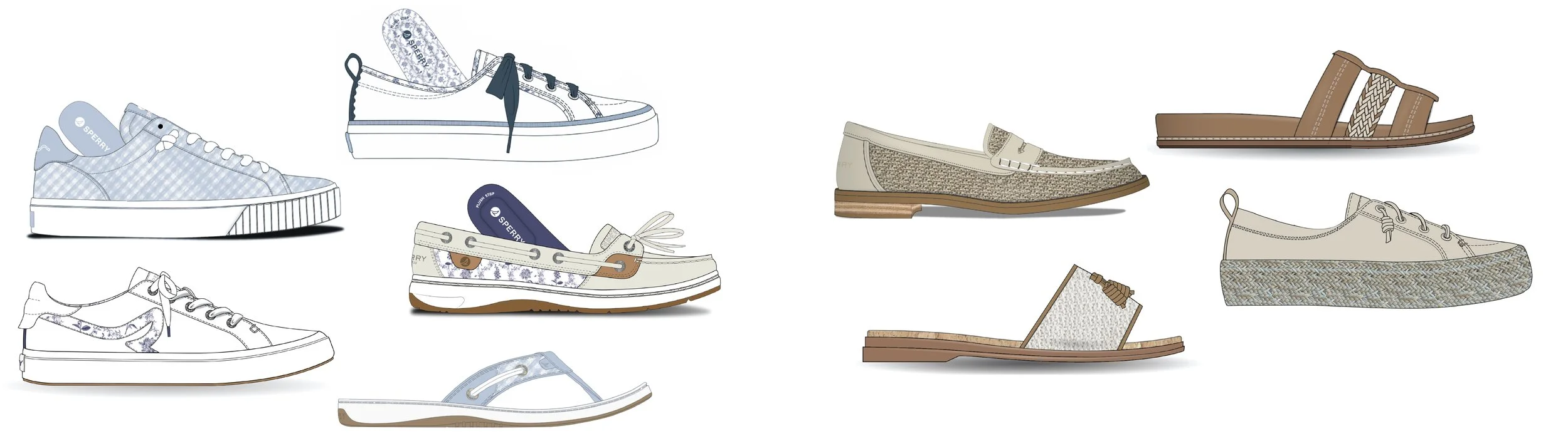
Garden Party
Showcasing the softer side of summer, this women’s trend was inspired by outdoor picnics in the garden. Soft floral and gingham prints tied this collection together, complemented by natural woven textiles. A cohesive color palette of ivory, cream and shades of blue relaxed the eye and coordinated beautifully with any sundress.
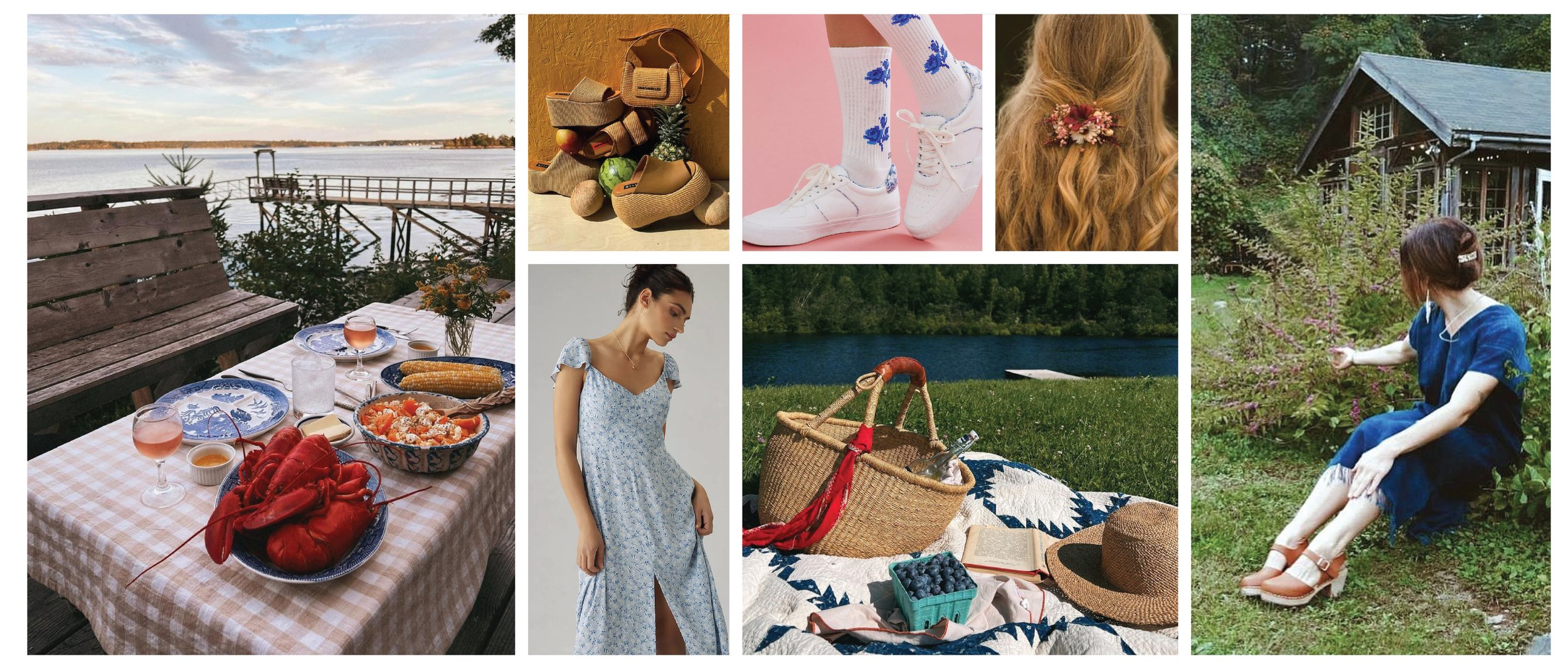
INSPIRATION FOR THE COLLECTION VIBE AND CONSUMER
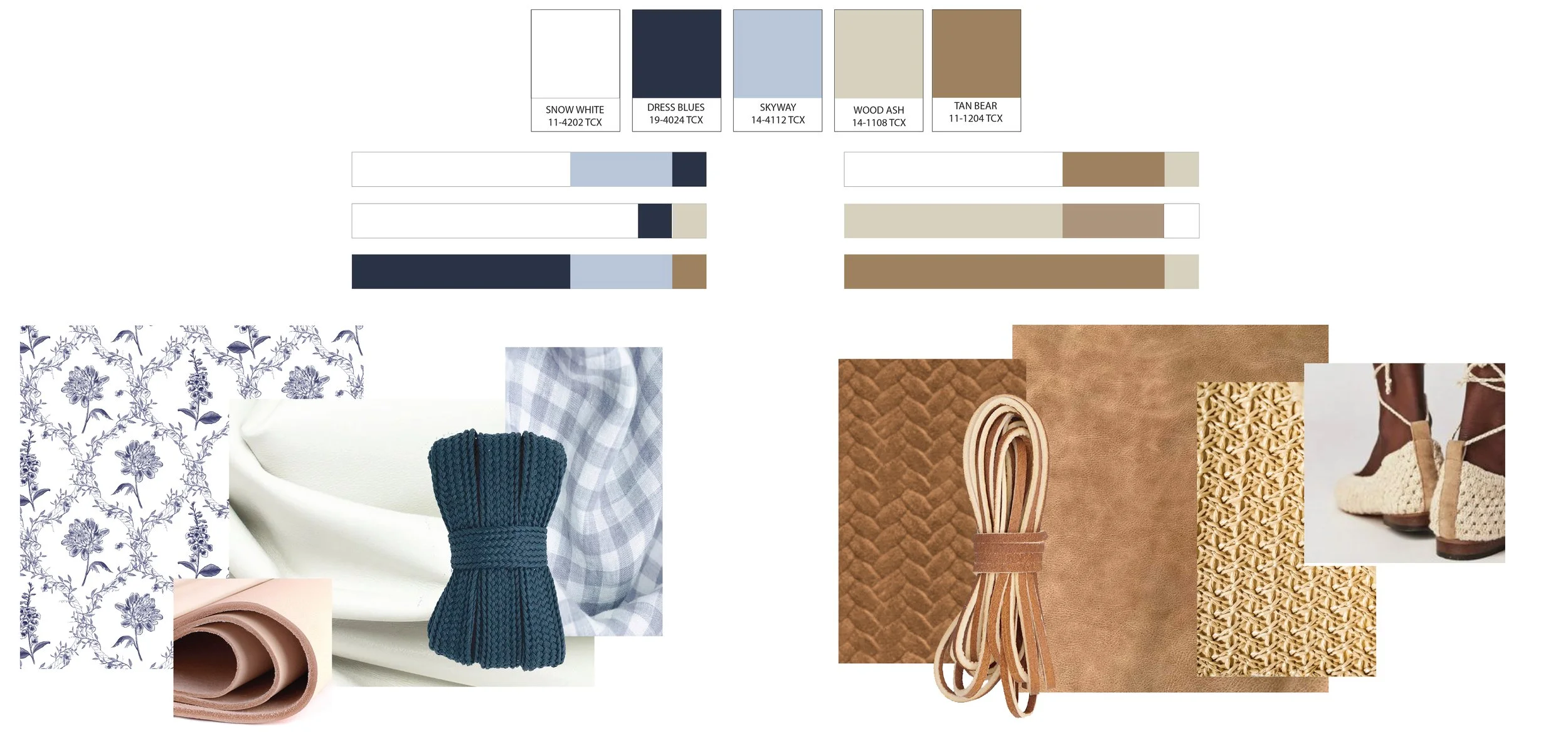
COLOR, MATERIAL AND PRINT PACKS
COLLECTION CADS
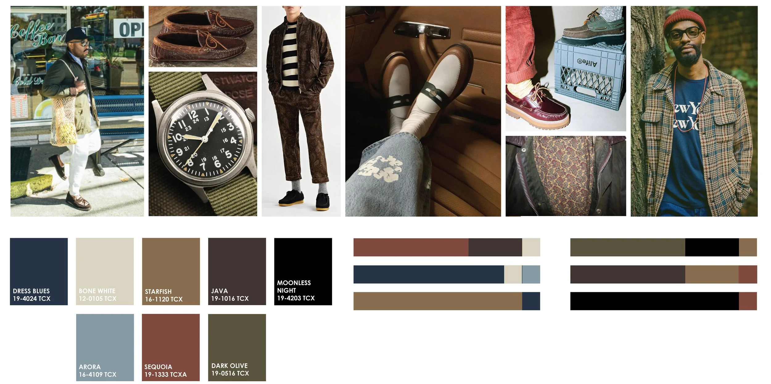
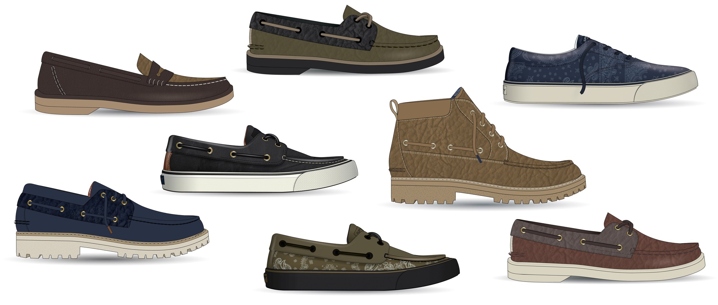
GRIT & GRACE
This men’s trend story was inspired by fall in NYC. Heavy tumbled leathers, waxed canvas, gutsy outsoles and a deep color palette brought this collection together. A washed-down nautical paisley print was used in small accents and linings.
VIBE AND COLOR PALETTE
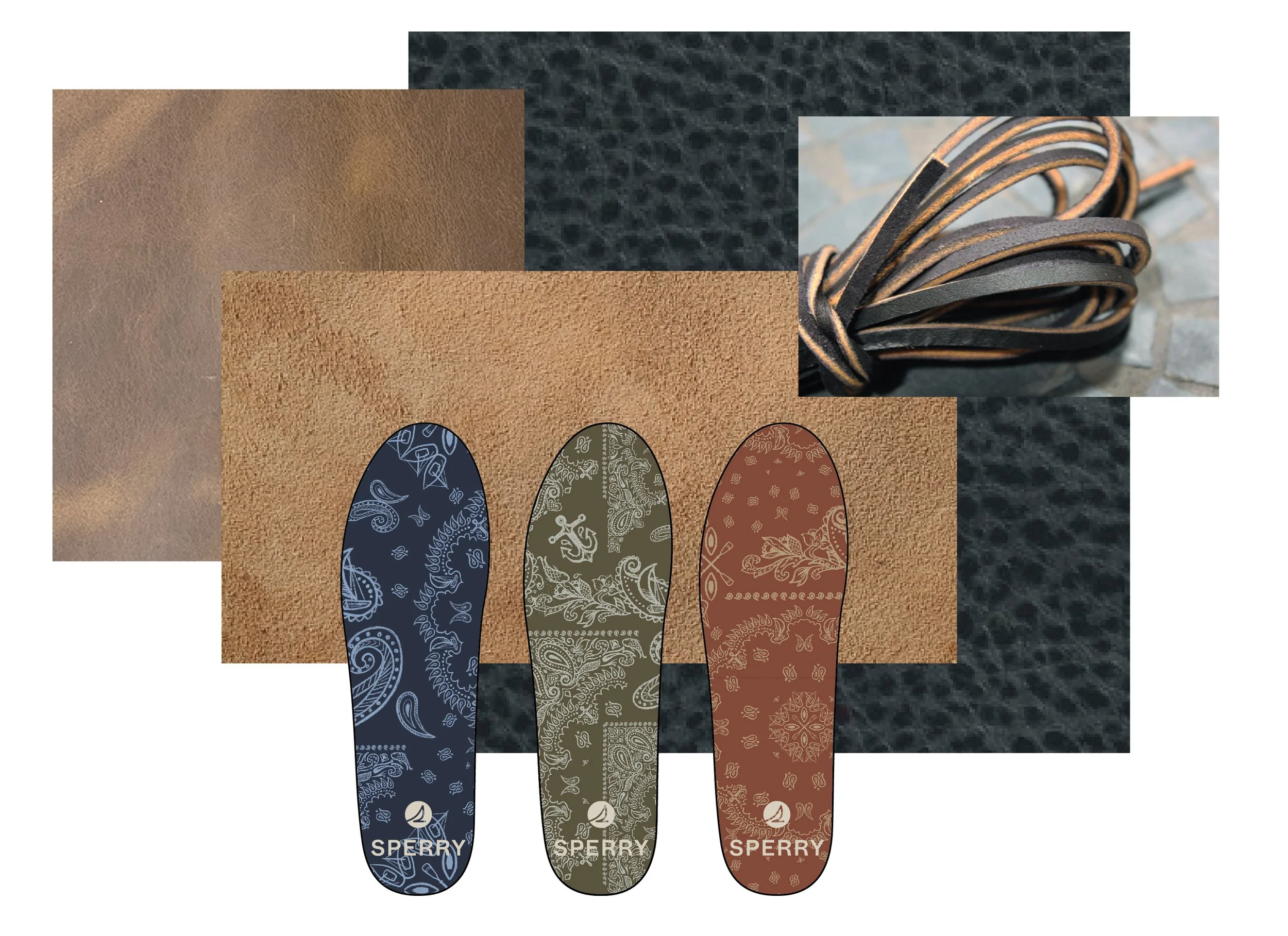
MATERIAL AND PRINT PACK
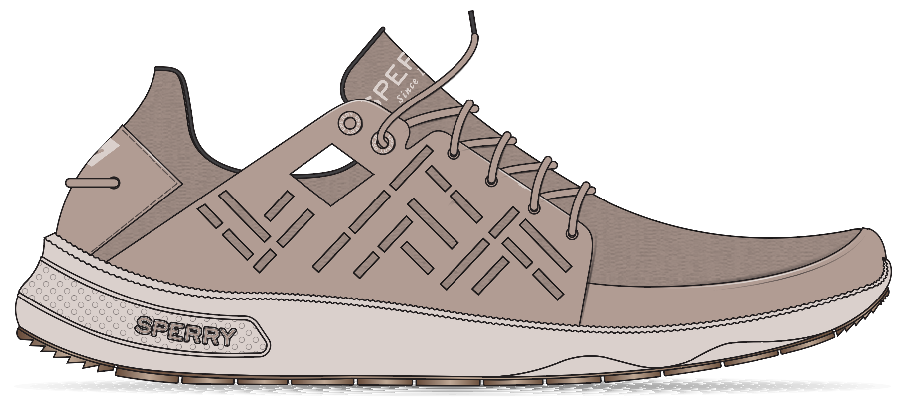
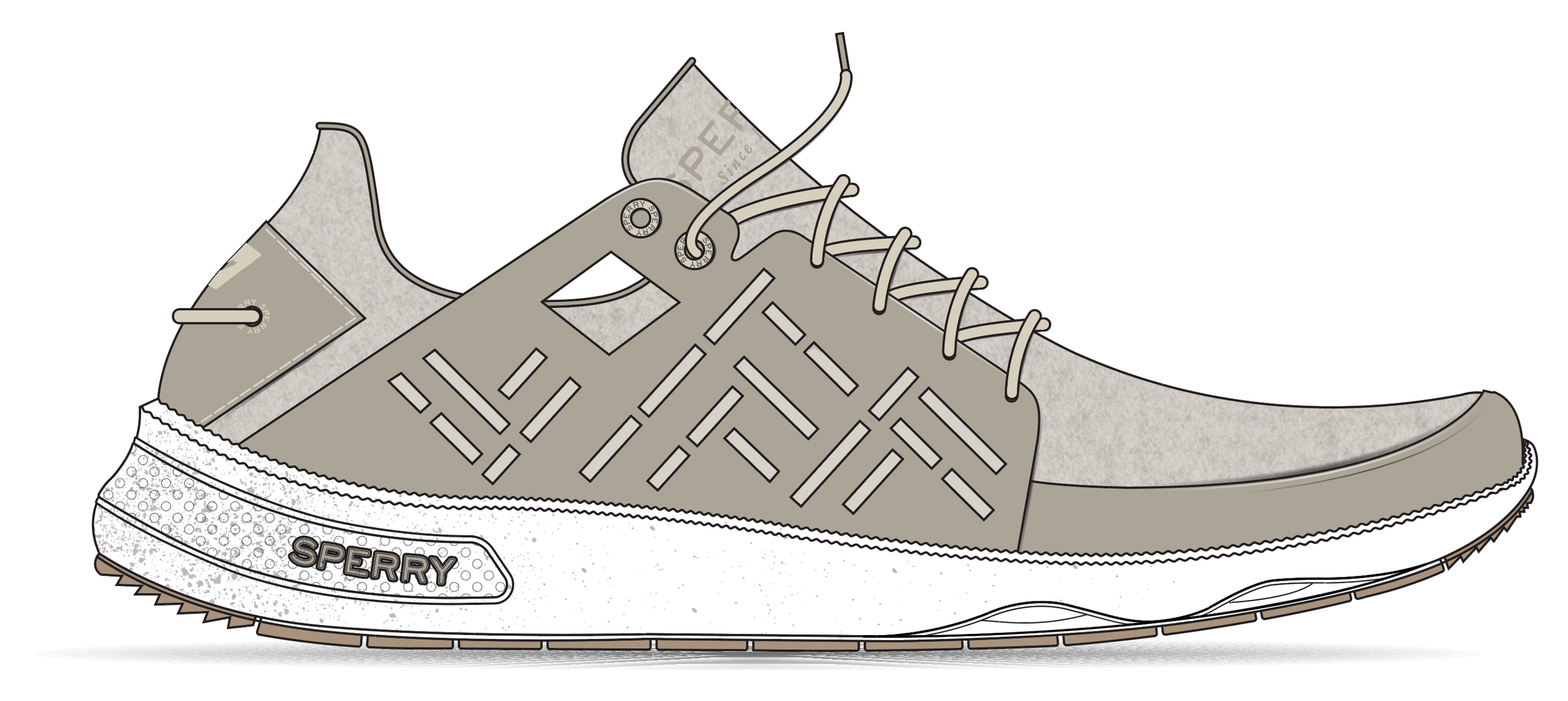
Great escape
This men’s trend story was inspired by the gorp-core trend and nomad movement. As work-from-home culture took off, the office could be anywhere. Warm neutral colors were accented with uplifting rust tones. Waterproof leathers were mixed with warm textiles, anchored with playful plaid accents.
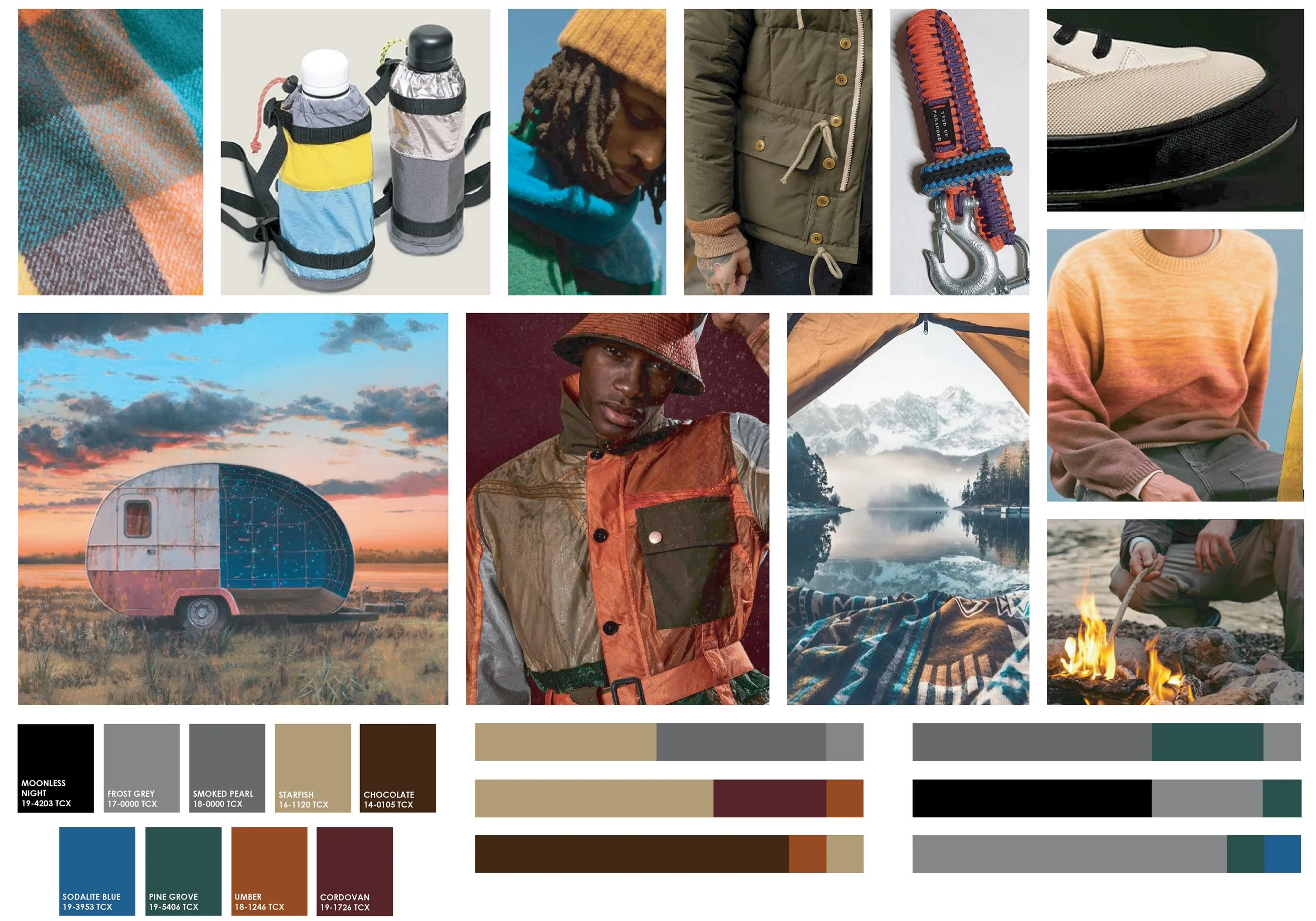
VIBE AND COLOR PALETTE
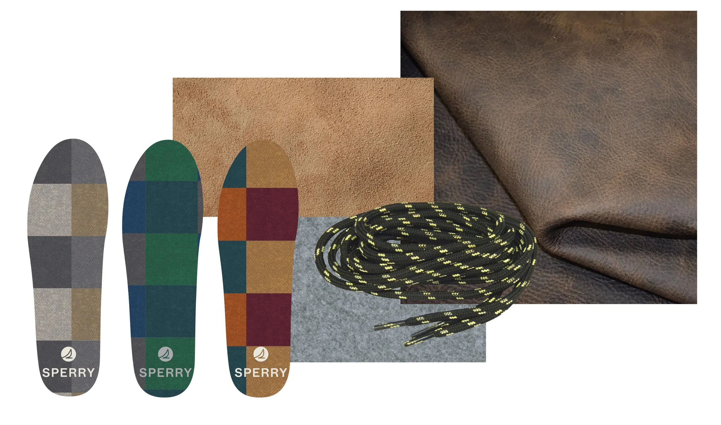
MATERIALS AND GRAPHICS